


The Difference Between UX and UI Design - A Quintessential’s Guide
There is a big misunderstanding when it comes to UX and UI design. Some people think these two things are the same, some others think one of them is more important than the other one. Well, I will clear things up and give you a better understanding of both these. Let’s kick it off with some quick information.
What is UX Design?
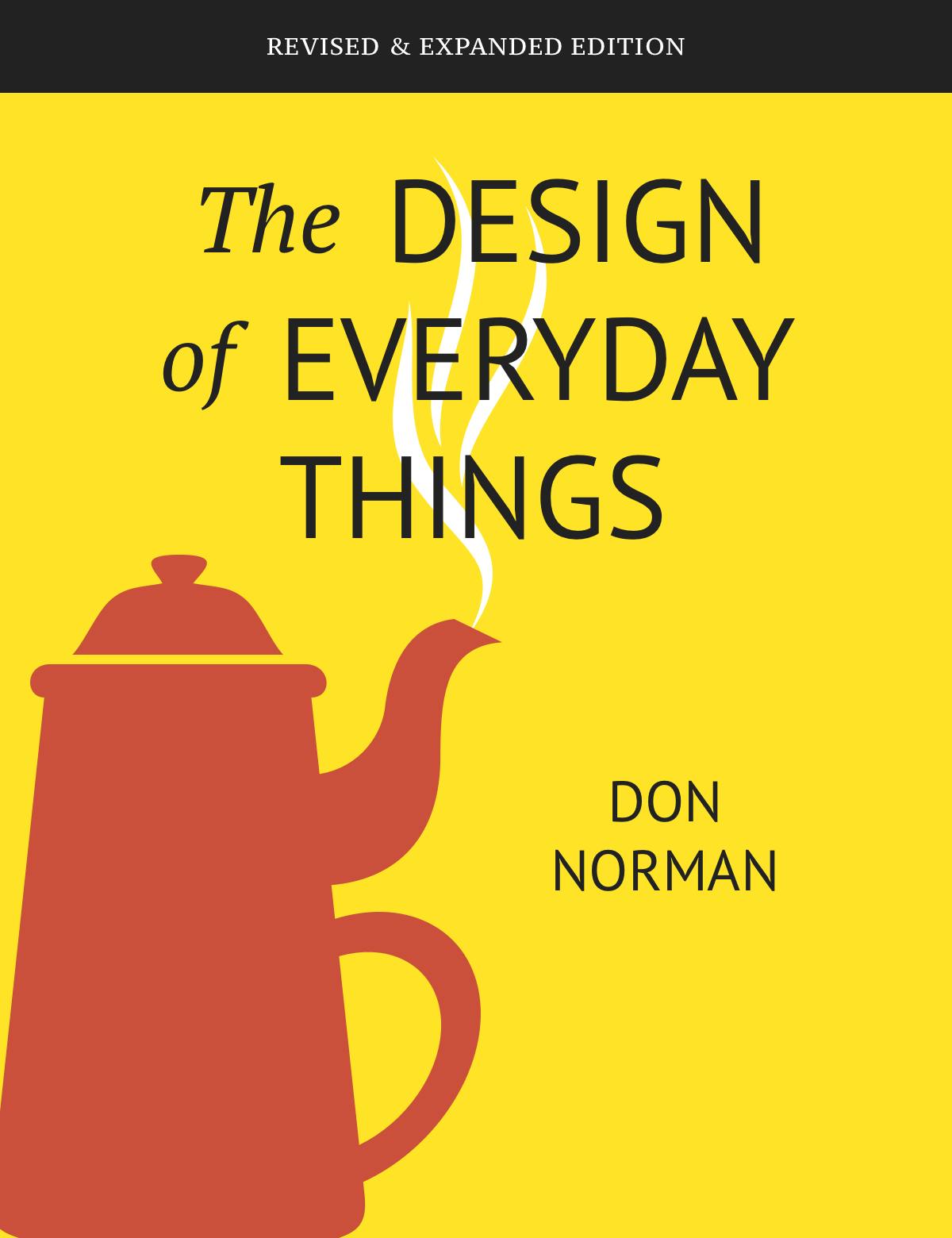
The term User Experience (UX) was coined by Donald Norman in 1993. He is considered the epitome of a user advocate by many due to his time at Apple as a User Experience Architect and which was the first case of “User Experience” used in a job title. Norman’s most famous book is The Design of Everyday Things that popularized the term so much. His background in psychology, engineering, and computer science was what led him to explore the idea of human-centered design. The concept is that machines and software should be serving the user’s needs. In the process of creating a product, the user’s action should always come first and be the dominant force behind the design.
The book Universal Principles of Design provides 125 principles of all the types of design. Like Jonny Grass I think that less is more so here five principles that are keys to UX Design:
- Hierarchy
- Consistency
- Confirmation
- User Control
- Accessibility
Hierarchy
Hierarchy is one of the best tools to help someone use a product easily. The first section of the hierarchy in most products is a navigation menu i.e. tabs. Secondary menus could be visible if you hover over some of the tabs, social icons, etc. For smooth navigation, you’ll, later on, see something like a card or an image. Users are used to that type of navigation too.
Consistency
When a product is more familiar, it’ll be easier for the user to learn it and have a better experience. That means you don’t have to redo every part of your design, it’ll be better to stick to standard patterns.
Confirmation
Imagine a user accidentally makes a payment or places an unintended order. If there are no confirmations between checkout and order review, users will have a hard time and their experience will fall apart. Confirmation messages for irreversible and important actions are highly recommended to make a user feel “safe”.
User Control
Users have a better experience when they control their actions. That being said when a user clicks on a button and an overlay pops up, they might want to go back. Imagine not having a Go Back button, users will most likely close the app or just have to re-open said app and start over.
Accessibility
It's safe to say a good product can be used by everyone. One of the main parts of UX is to focus on removing obstacles for people when they use the product even if these are permanent or temporary.
UI plays an important role but it is not the only part. UX design is a process that aims to create a product or site that users find easy to use and quickly understand and through the UX process, we arrive at the right UI.
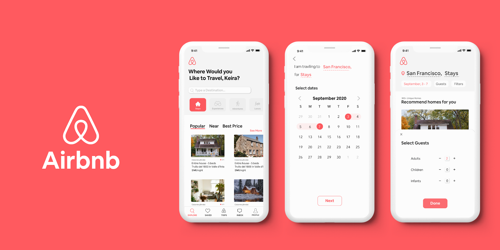
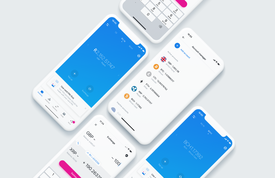
You don’t need to sacrifice one to have the other. UX designers focus on pleasure, efficiency, and fun too, they don’t just focus on usable products, plus they take part in the whole process of creating a product, to deliver a fully functional and accessible experience. Two great examples of a good UX would be the Airbnb mobile app and Revolut.
UX isn’t all about usability. Well, it’s important to have great usability on your products for any user experience to be a success. A UI can be designed to be extremely useful but fall short when it comes to delivering the right things, at the right time, in the right way.
What is UI Design?
Now on the other hand we got User Interface (UI). A good UI allows the smooth completion of any task and makes a user-friendly experience. This means users have to provide minimal effort to achieve the desired output, and also that the machine limits undesired yields to the user. We’ll start with four principles.
- Clarity
- Organization
- User attention
- User control
Clarity
Having a clear understanding of everything you see on a screen does surely gives you a great experience. When a user recognizes and understands the interface, that helps them predict what will happen on their next action.
Organization
Having an organized product can make the many appear as the few. Users won’t have to think about how some components are related if you do this for them. Show only what’s necessary on each screen, don’t confuse users by adding multiple things that aren’t relatable on the same section/screen.
User attention
To keep a user’s attention, you don’t want to have unnecessary elements that distract them from the main point. Whenever you want a user to make a payment or send an order, don’t clutter the screen with random elements.
User Control
Same as UX, users love to have control over their actions. You don’t want the user to reach an unpreventable point. Always think ahead of the user, what will happen if a user makes a wrong action and reaches a point where there is no Go Back button, how do you prevent that? Create interfaces where users operate flawlessly and without confusion.
The best interface is no interface, giving users an accessible and easier to control product will give them the best experience, and keep in mind that you can always make things simpler. Don’t overdo it.
I hope I helped you distinguish the differences between these two and I hope that from now on you’ll be able to understand when an interface is bad or the usability is confusing ;)
Oh and don't forget to follow this LINK to get access to some great resources and ideas for your designs.
 Message sent!