


5 Don'ts in Mobile UX/UI Design
Mobile design is very important since the majority of people own a mobile device and access the digital world through it. We need to give them a good user experience. So, these are my suggestions to get closer to achieving that.
1. Don’t design for a specific type and size of mobile device
Mobile screens come to various sizes, from very small to very large. As a good designer, you have to find a way to make your app fit well in all of them so that all users have a positive experience. How can you achieve that? My suggestion is to design for the smallest available screen - which is probably the 320pt width screen - first, and that’s because on that screen you will face the most limitations. Create your design based on those limitations, that will also help you discover what features are important for your app and which are not, and make it fluid, which means that the layouts should be expandable to fit the larger screens. The fluidity is necessary. When a layout is fixed to a specific size, it will not be responsive. It will overflow when putting on smaller screens and appear narrow in larger ones.
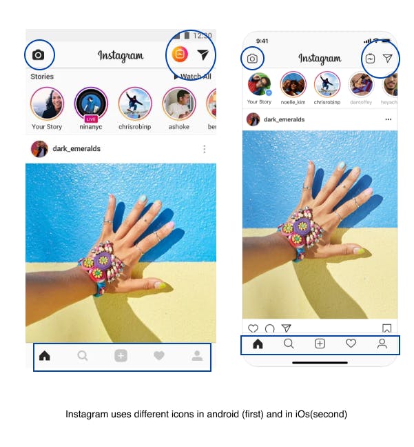
Another factor that you should take into consideration if your app is addressed to iOs and Android devices, is the differences between them. Some of these differences are detected in the sizes of buttons, icons, inputs, tap targets, fonts, and the way the navigation happens. Generally, for android devices, you have to follow the instructions in material design and for iOs, those in the Human Interface Guidelines.
2. Don’t fail to take care of typography
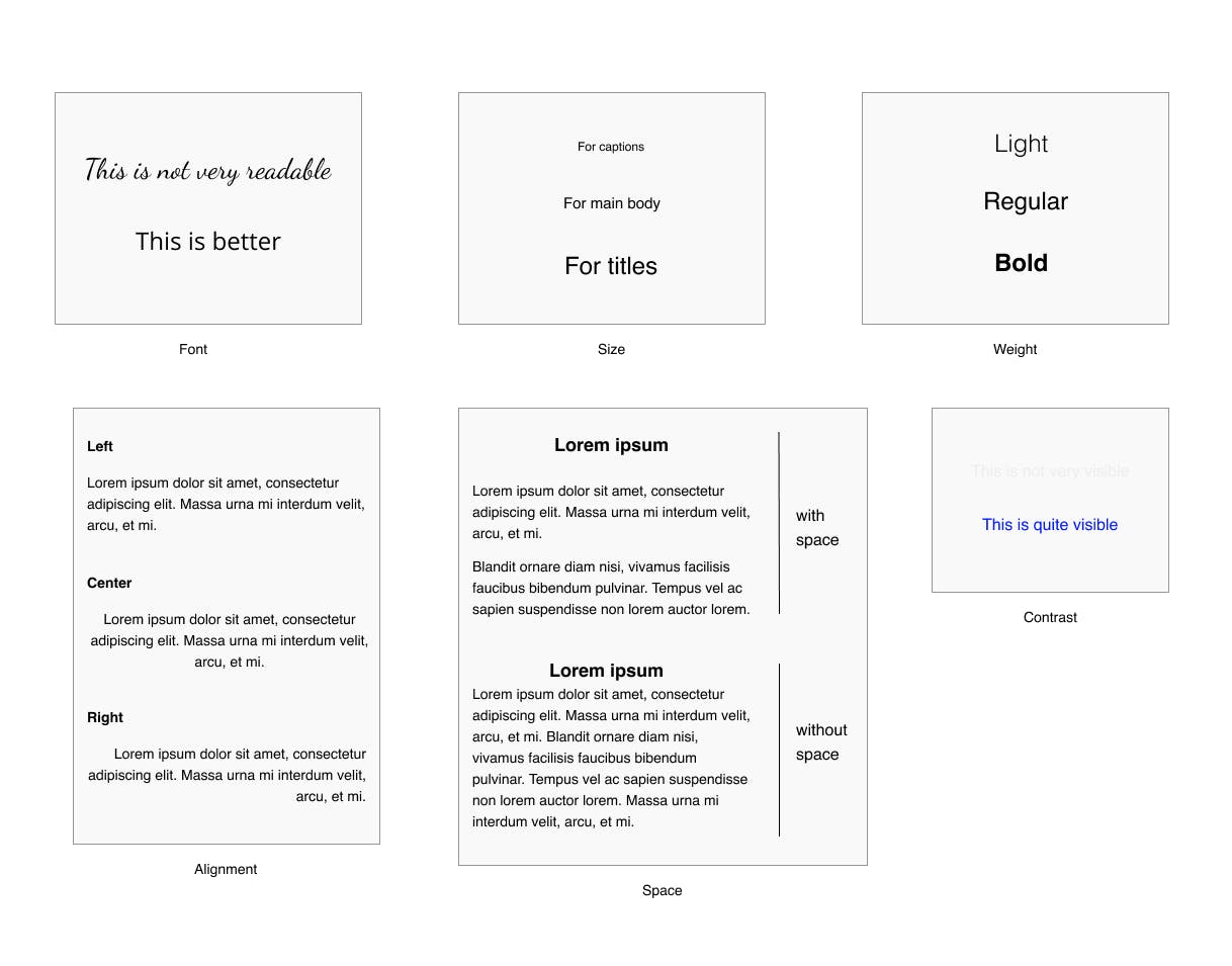
Typography has to do with everything written on the screen. The font, the style, the size of a text, are all part of it and it requires a skilled designer to make the decisions in that area, in order to create a special app that stands out. Bad typography will leave a negative impression on the user, no matter how useful your app is. So, it is one of the factors that shape a good UX experience and you have to pay attention to it.
- Font: The first thing you should look for in a font is how readable it is. An over-decorative font may seem beautiful but possibly will not be easy to read and therefore will cause frustration to the user. It is better to go for the simplicity in that part, but also search for a font that doesn’t get used a lot, so your app will have some uniqueness.
- Size: This is also very important since the mobile screen is limited. A small font will make things difficult for the user, who will have to zoom in to read the text. A large one will take a lot of space for one sentence, which is not very practical and again will make it hard for the user to read. So, what’s the right size? According to iOs typography guidelines, the font should be at least 10pt and for the main text, the suggested size is 17pt. For Android, the main text should be 14pt or 16pt. Also, with size you can create a hierarchy to your text, meaning that the more important parts of the text, e.g. the titles, can have a larger font size in order to get surely noticed by the user.
- Weight: Besides the size, you can create a hierarchy by using different font weights. By making keywords bold, you will grab the attention of the user on them, even if the user won’t read the whole text.
Some other things you should keep in mind are:
- Alignment: The text should be aligned. Left side alignment is a good choice because the user’s eye will follow it more comfortably.d
- Space: Don’t forget to make paragraphs and leave some space between them to make the text more readable.
- Contrast: This is another thing that will make your text more readable. If the text color contrasts with the color of the background, the text will pop out. If you choose a white background and a very light grey for the text, it will be hard to read.
3. Don’t ignore the way people interact with their phones
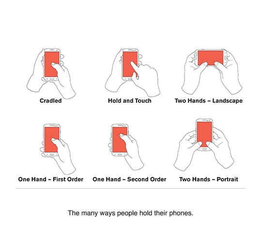
When you start to do your design, you should think about how the users interact with their phone, how they hold it, in which areas are convenient for them to look and tap, and then decide how it is going to be formed.
The first thing you should take care of is the location of your content. Keep in mind that users prefer to look and tap at the center of the screen, so you better place the functions and the content that you consider important and you want them to notice. Also, you better avoid putting content at the areas where the user's fingers usually stand, for example in the edges of the device, so it will not be obscured.
Second thing, make sure that the touch targets are large enough for the user’s finger to tap comfortably and also, give the user a clear indication of a successful tap as a confirmation of his/her actions.
Another part of a user's interaction with the mobile device is scrolling. Possibly, your design will include scrolling, whether the whole screen can be scrolled or a list. You need to leave the right amount of blank space for the user to scroll easily. Most users prefer to scroll at the right side of the content, so ensure that there is a reasonable margin that allows gestures without them hide content or go on clickable items and unwanted actions happen.
4. Don’t replicate the web experience
User experience on the web is different from user experience οn the mobile, so there is no point in trying to bring one into the other. The right thing to do is to create a design that adapts well in the mobile environment and overcomes its limitations.
One of the limitations that you will face is the size of the screen. Mobile screens are obviously much smaller than the ones of laptops or desktops, therefore you can’t display the content in the same way, you need a different layout. In fact, you may need to skip some content and features that are not of great importance, in order to save some space and make a more efficient mobile design. You also have to take into consideration that mobile users use their fingers to interact with the screen, not a mouse, which means that is necessary to make the clickable items quite visible and easy to get tapped on.
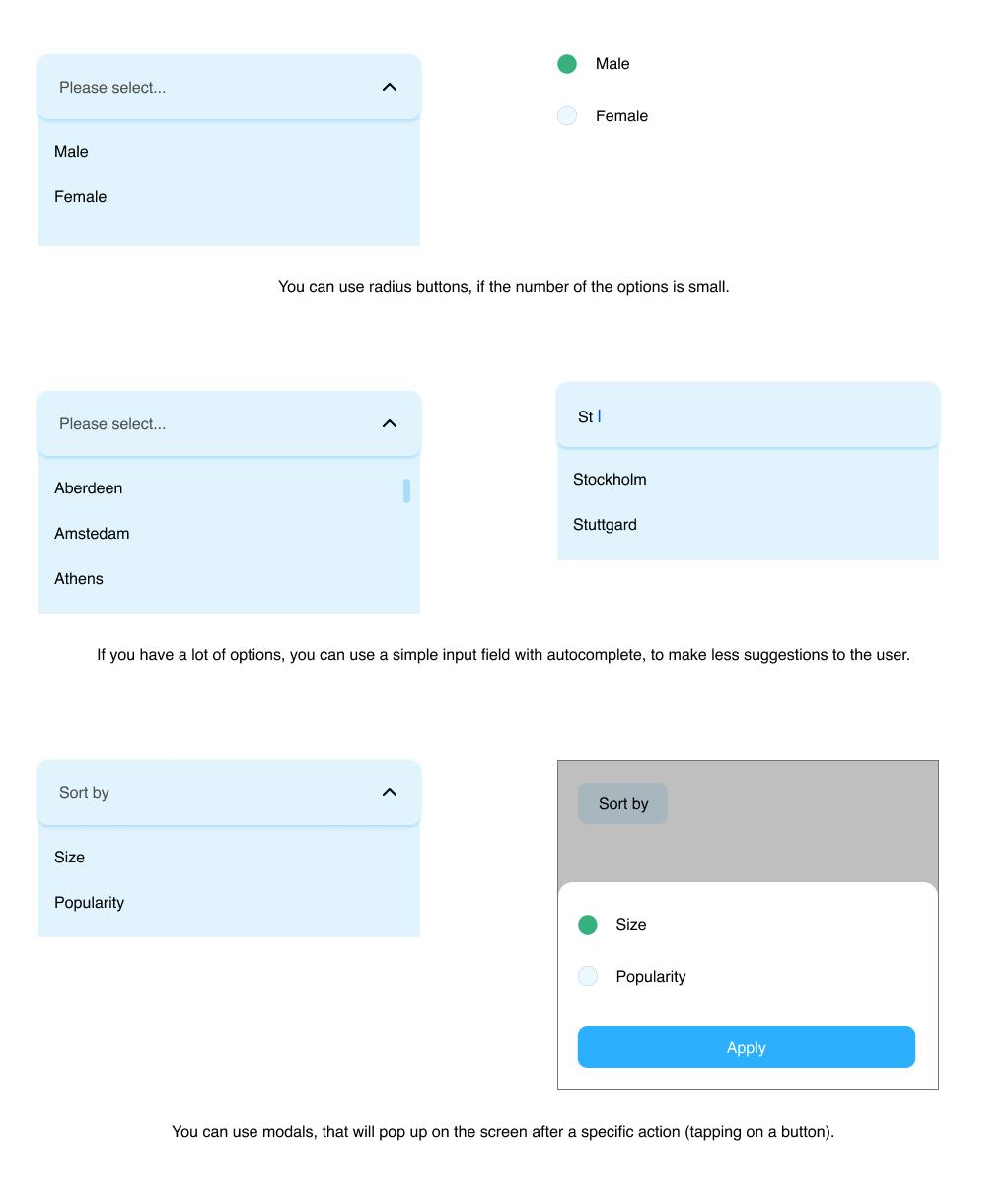
Moreover, there are some features that fit only in the web page model and not the app model, such as underlined links. It is better not to include underlined links in your mobile design because they are not easy to interact with. It will be hard for the user to tap to an underlined link, due to the small space it takes. It is better to use buttons. Another feature that is wiser not to include, is the dropdown menus and here are some reasons why not to: Selecting an option from a dropdown list is a multi-step process that contains tapping on the dropdown to open the list of options, scrolling and scanning through the items to select one, and then closing it. Also, scrolling through the options might be painful (especially if there are a lot of options) on some mobile screens where the visible and scrollable area of the list is small, for example, if the dropdown is close to the bottom of the screen. It is better to use some alternatives, like this:
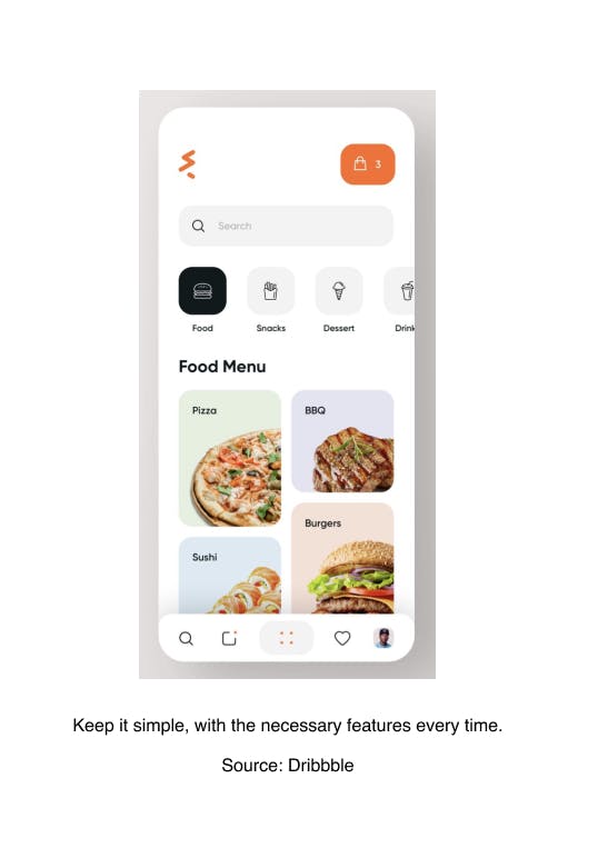
5. Don’t put too much content in one screen
When you have a big load of content, is not an easy case to organize it. In this situation, there is a principle that will help you and you should keep in mind: Put minimum content on the screen. It is not necessary to display everything on one screen. The more you add, the more complicated you make it for the user, who will drown in a sea of information and nothing will grab his/her attention at the end. The ideal is to put one primary action per screen. It will take a lot of screens, but is better than have fewer and cluttered ones. Designing screens that support one single action of real value, make your app clear and easy to use and learn. This single action will surely get noticed by the user, who will tap on it and navigate to more content. Don’t forget to create smooth transitions between the screens for even better user experience.
We are really glad that you stayed until the end. Therefore, -we have something extra for you.
Follow this LINK to get access to some great resources and ideas for your designs.
 Message sent!