

10 UI Design Trends for 2021
A User Interface (UI) is where usability and aesthetics meet. It’s the main access point a user has to your app or website, and thus it needs to be user-friendly and also look good.
As times change, so do the trends in UI design, emphasizing certain aspects, while putting others in the background. So with no further ado, here are the top 10 UI design trends for this year.
1. Minimalism
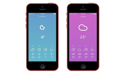
Screenshots from the weather forecasting app ‘Sky’ / Source
Minimalism is perhaps the most popular design trend of the last decade, with no apparent signs of slowing down. On the contrary, minimalism is gaining popularity still, in almost every aspect of design.
This is far from surprising. Cluttered designs are confusing, and tend to distract the user’s attention; not ideal when keeping your customer engaged translates into sales and branding.
What’s more, a calculated minimalistic approach tends to gather the public’s attention and respect, while it builds trust in your product.
A word of advice though: Minimalistic designs must balance simplicity with ease-of-use, otherwise you risk driving users away from your product.
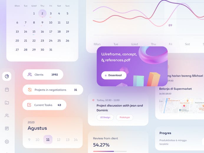
2. 3D Designs
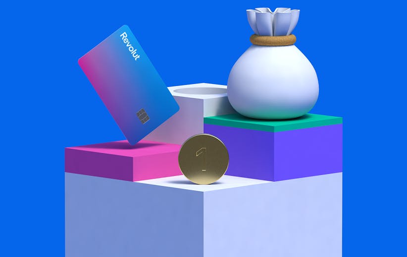
Revolut’s new 3D Illustrations /Source
Ever since the beginning of the digital era, developers and designers alike have tried painstakingly, to integrate 3D visuals. Unfortunately, the technology available at the time, made it more of a useless gimmick, rather than a substantial design choice.
That is not the case anymore. True enough, we now have the technology, processing power and tools, to render 3D imagery faster, and more efficiently than ever before, thus allowing designers to integrate exciting, sleek graphics to products and UI’s.
3D elements add a deeper, more elevated, and, oftentimes, a premium feel to a product, making it all the more engaging and appealing to users.
3. Glassmorphism
Glass UI elements /Source
Glassmorphism is a layered glass effect, which comes in most popular UIs such as Android OS, iOS, Windows, and MacOSX. In practice, it consists of glass-looking menus and windows, where the active elements appear as etched on glass. The background elements are blurred, sort of like looking at them through frosted glass.
This design helps maintain focus on the active and interactable elements on-screen, while subtly giving the user a sense of orientation within the UI. At the same time, it allows them to distinguish between active and inactive windows at a glance.
4. Skeuomorphism / Neomorphism
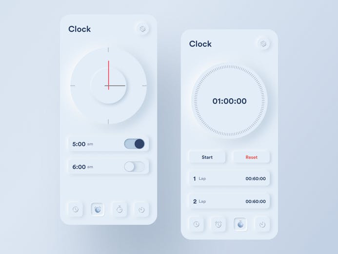
Skeuomorph Clock App /Source
Skeuomorphic design was actually somewhat popular in the early 2000s and it now makes a comeback. Skeuomorphism applies the principle of mimicking real-life objects and textures into UIs. A fine example of the skeuomorphic design of the time is the early iterations of the 1st-gen iOS.
Nowadays, skeuomorphism has evolved into neomorphism. It is a transition from the earlier flat designs of the decade, which came to be considered rather simplistic, to a more sophisticated, deep, and detailed design, while retaining the minimalistic approach of skeuomorphism. To this extent, we can consider neomorphism a bold return of skeuomorphism, albeit with a more fresh and refined character.
5. Dark Mode
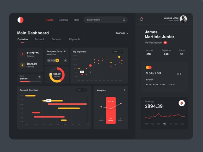
Dashboard UI in dark mode /Source
A UI trend that became mainstream pretty recently. Dark Mode is essentially an option to change the UI into a dark theme. Nowadays, it can be found in almost every piece of software out there. You may have seen it under different names like Night Mode, Lights Out, Dark, and Dim.
That said, Dark Mode is not just a gimmick or an aesthetic choice. In fact, Dark Mode is practical in two very important ways. First, it’s energy-saving, as dimming the screen to display those sleek dark menus, significantly cuts down on battery consumption. Second, it reduces eye strain, specifically when used in dark environments, which let’s face it, happens almost every day.
6. Mobile-first
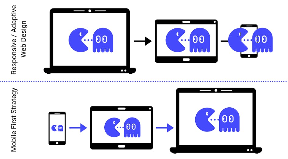
Mobile-first design /Source
Smartphones and tablets have become a staple of everyday life. In many cases they replace a desktop or laptop computer completely when it comes to functions like browsing the internet, online shopping, emailing, and even doing business.
Such a massive shift, calls for drastic design changes, to better suit the more compact mobile screen. In that respect, mobile-first is a trend that focuses on optimizing UI’s for touch input, gesture controls, aesthetics, and overall ease of use in mobile devices.
7. Voice User Interface (VUI)
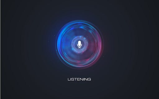
Voice AI design /Source
Voice user interfaces make use of advanced natural language recognition in conjunction with voice recognition software tools to enable users to control and interact with their devices through speech.
This upcoming trend started with the various assistants that came with the native OS of smartphones and are now expanding rapidly, making it a must-have UI element. For this reason, developers are not only looking to implement both voice and text input into UI’s but also make it as natural, interactive, and effective as possible.
8. Onboarding UX
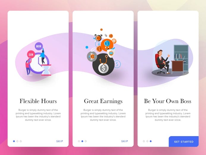
Onboarding UX illustrations / Source
Onboarding UX (User Experience) is, to put it simply, a brief introduction within the application. Essentially, it helps users understand the key features and philosophy behind the app.
Modern Onboarding UX design calls for clear, simple, and brief presentations, which are ideally distributed within the app and its UI. This way, users get a better idea of what they can do with the app, when they need to, as opposed to having to swipe through endless tutorials just to get to the home screen.
9. Colour Trends

A pastel color palette / Source
Colour plays a critical role in every kind of design, and UI design is no exception. The right color palette will successfully convey your message to the user, enhancing the UI’s effectiveness and engagement.
Even though many developers have made a turn to more shouting and vivid color palettes, reminiscent of previous decades’ styles, the mainstream tendency for minimalism and simplicity is towards more washed out -pastel- colors. These kinds of colors have a calming and soothing effect while helping users maintain focus.
Accordingly, we see colors like fiery reds, bright greens, and magenta, being replaced by more subtle ones, like raspberry, sea green, and rose.
10. Font Trends
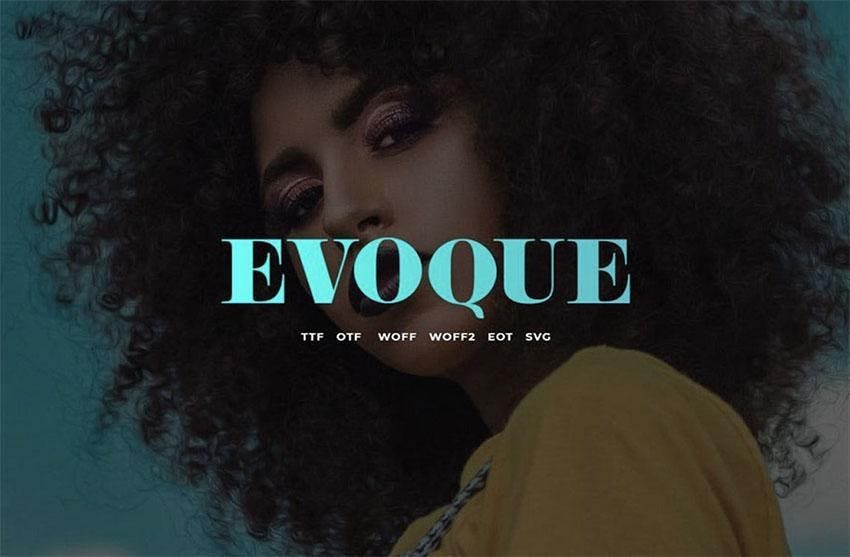
Evoque, an uppercase serif font family /Source
Another rising trend in UI is the use of large typography. Large typography is about unique typefaces that make the text stand out, without sacrificing clarity or legibility.
Such designs are simple, straightforward, and eye-catching, effectively capturing the attention of users, who tend to scan, rather than read through the entire text. Keeping this in mind, a designer must often create typefaces that will help their message stand out.
According to Envato, you can’t go wrong with fonts like Athena, Evoque, and Themagic.
 Message sent!